I took four days to shape up a nice answer to you but the javascripted reply box ate it so this is going to be a short and swift summary out of memory.
Why are your driving this agenda for width=100% elements (plural) when you know such elements are troublesome? It has noted to you earlier in the wikias community already and you didn't address the question then either.
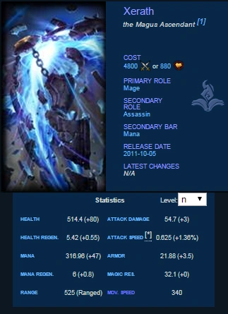
If you compared the Yaga and present champion structure, Yaga presents the static info in nice neat box and has real intro but then it starts to crumble. As the infobox is not hoovered, the lore wont get to warp around. Also the lore is placed before abilities, lore that is static and hardly every read more than once. Its the abilities people come to read, over and over again. Or when have you last time heard patches changing the lore or people asking how lore synergies with black shield? I mean, just look how much space the present 'infobox' has filled with nothing compared to the Yaga one. Amount of info given is exactly the same. As extra bonus, I circled something that should ring a bell if you compare the two templates.
For the ability section parts, why you want to force a element with highly dynamic content that is fixed to take 50% of the article width? Some abilities have zero notes/info/whatnot, others have tiny ability description and tons of notes. Yet, you want to place them side by side instead of beneath each other when they would be displayed nicely no matter what the screen resolution without having huge empty gaps in any where, thanks to thing called magical text wrapping.
For the white space part, as you yourself noted, there is unnecessary whitespace and thats what I am reffering here. As you push these width=100% elements (again, plural) it creates stuff around them that makes them look airy, granted, but also gives nothing and pushes the things people have came to read future down. Three pages of white space [1][2] is not cool or a design thing, its just job done badly.


